Introduction
Terminal Velocity (working title) is your ultimate airport companion, getting you to and through the airport as seamlessly as possible. This project was undertaken as part of an intensive UX design course, but expanded beyond the scope of the course.
Inspiration
I don't travel terribly often, but I've logged a decent number of hours in airports all over the world - yet the true inspiration for this came from earlier this year when I traveled to the LA area with my family (including two children...) and the realization that traveling is great, but really only when you reach your destination. Actually getting there always seems to be a hassle. Which led me to the question: How can the air travel experience be improved?
User Research
For initial user research I interviewed 5 users about their air travel habits and preferences. They ranged from casual, infrequent leisure travelers, to frequent business travelers, or a mix of both. Some findings include:
- people are trying to find the amenities and services they need at the airport, and get where they need to go, as quickly and easily as possible
- navigating the physical space of the airport is often difficult, especially with less familiarity with a particular airport
- this problem is typically experienced after having passed through security, and having entered the secure area(s)
- people are trying to make the entire experience hassle free
- some users preferred to keep to themselves, while others were willing or preferred to ask someone for help navigating
These findings led to the following problem statement:
How can a traveler independently find where they need to go/what they need to do in a timely manner?
Sketching/User Flow
With the focus on navigating through the airport space, I began sketching what the experience might look like, and from there developed an initial, basic user flow.
Paper Prototype
With the user flow I'd developed, I made a paper prototype to see what that flow might look like.
Information Architecture

Card Sort Results

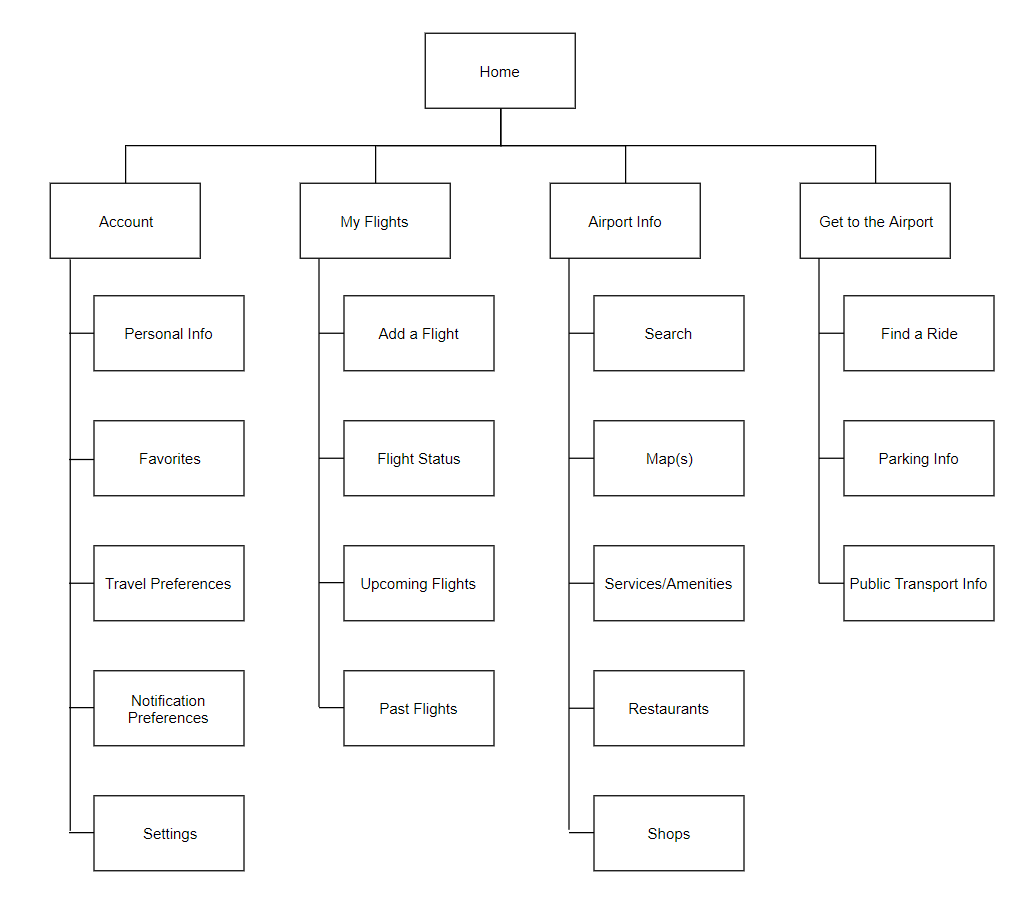
Sitemap
Wireframing
Initial Prototype
Improved Wireframing
Testing with the initial prototype produced good results - users were able to complete the task set before them and could navigate the flow without issue. Some improvements were suggested and ultimately implemented, including changes to clarify and enhance the overall experience.
Second Prototype
The second prototype incorporates user feedback from initial testing.
Explore below or open https://tinyurl.com/y2g8jh74
Third Prototype
The third prototype is an enhancement of the second. Additional screens built out, improvements made to text and graphic treatments as well as the overall flow.
Explore below or open https://tinyurl.com/y6cnb7ux