I worked with a small team of developers at Boston Scientific to improve the experience and overall visual design of one of their internal applications. This was a well-established app that had been in use for over a year, with reasonable but initially reluctant adoption. The team wanted to improve its facility and generally make the experience more pleasant for their users. Thus I began by creating an inventory of the app, documenting interactions and flows and recommending ways to improve them. We were able to reduce the number of user interactions needed to complete tasks as well as clarify those tasks and how to complete them. I further recommended putting analytics in place, in addition to user testing, to see which data their users were most frequently accessing and what was most relevant to them, to inform subsequent iterations of the app.
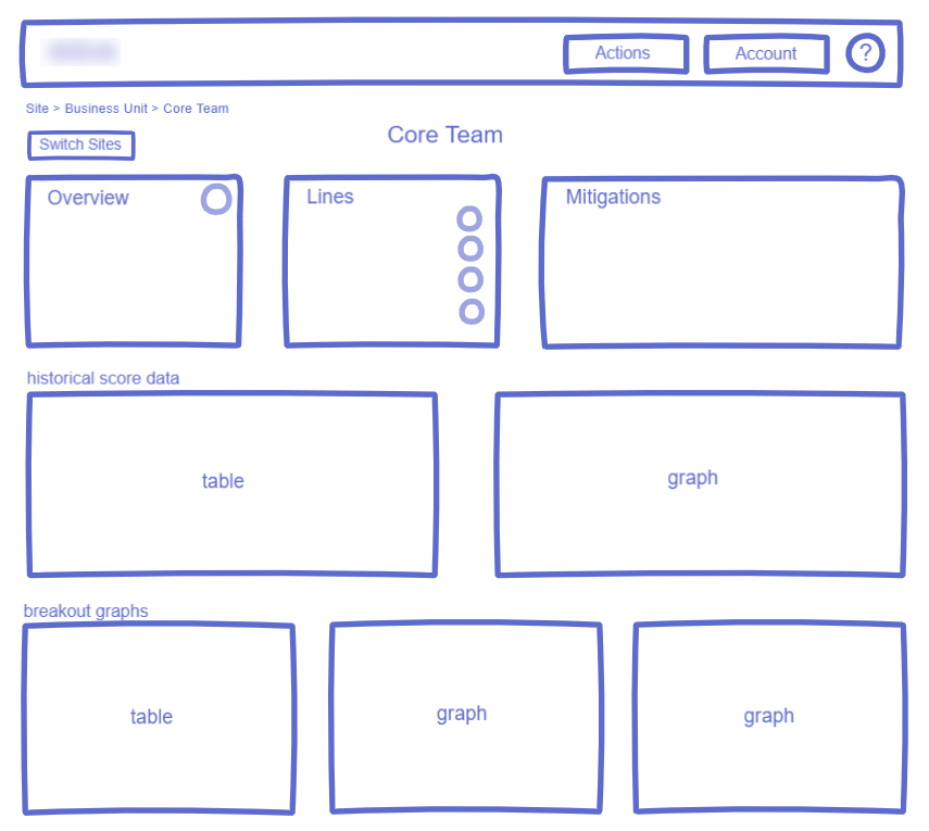
As the main focus was the visual design, the remainder of the project was dedicated to its improvement. There were five main screens that needed to be redesigned, four of which had the same or similar layouts and types of information displayed. The greatest challenge we faced was in how to display the abundance of text/data in a clean way that made sense and was useful to the user.
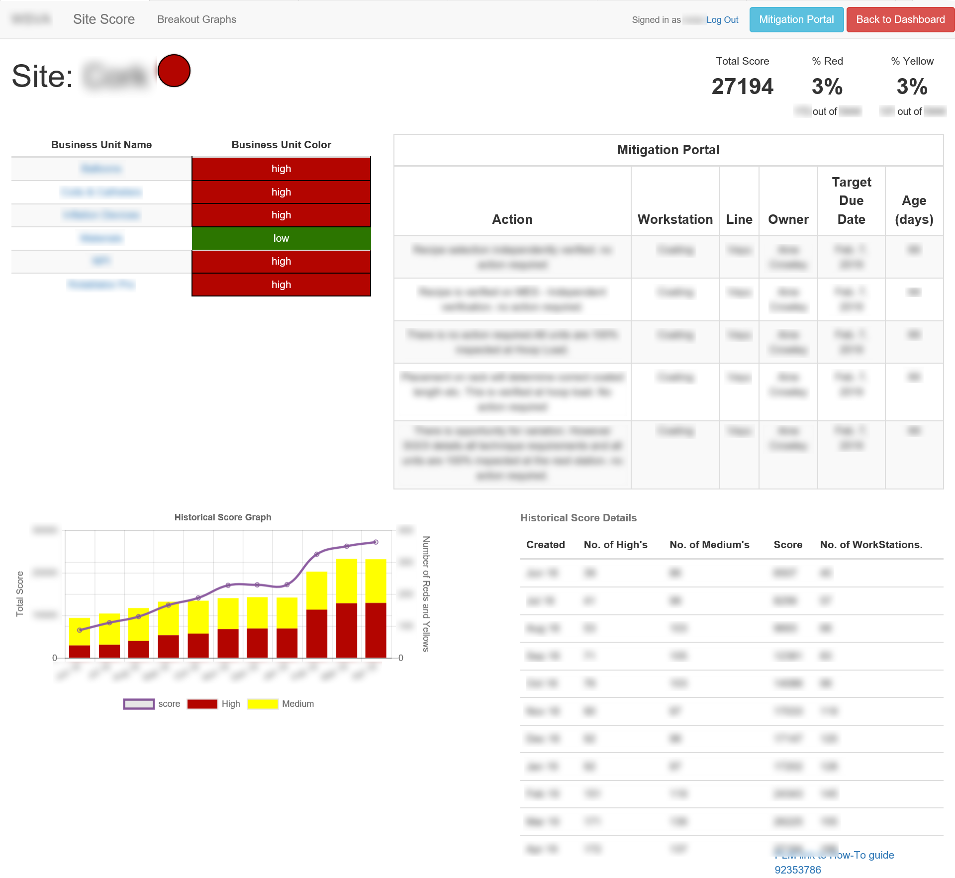
A screenshot of the main screen of existing app - three other screens further down in the hierarchy were nearly identical to this
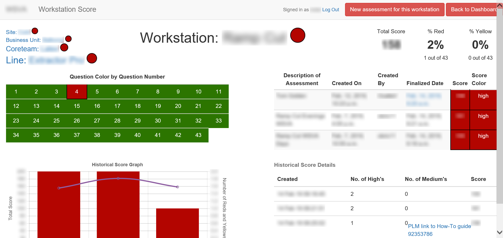
The fifth main screen, a unique view/layout.
I started by examining the information and how it could be reorganized and cleaned up for ease of use, and sketched out possible layouts. As some users might need access to multiple "sites," I proposed a customizable dashboard that would allow the user to more easily access the information most relevant to them.
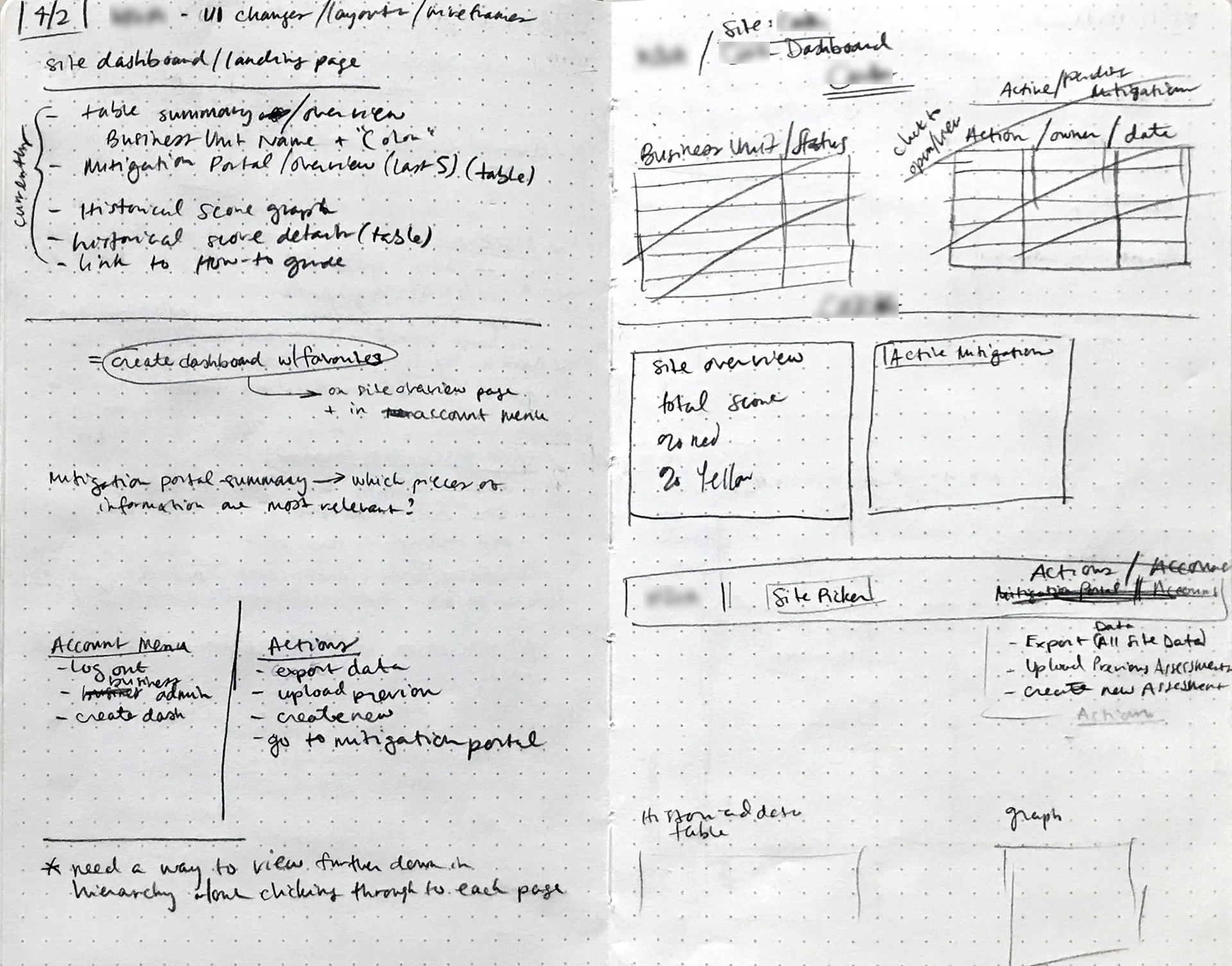
early UI notes and sketching
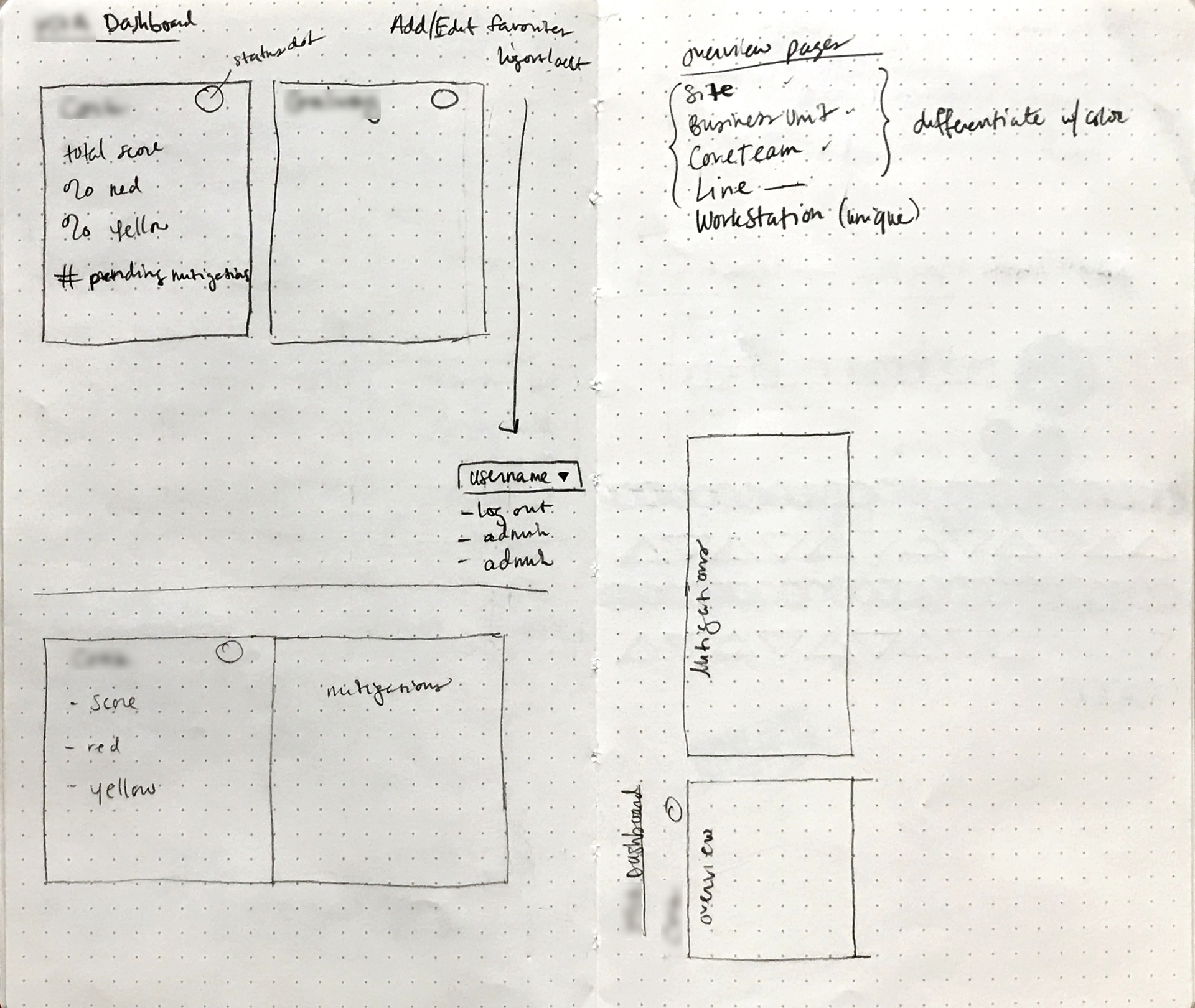
early UI notes and sketching

dashboard view
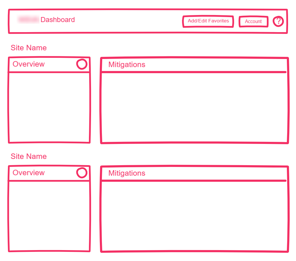
dashboard view - alt 1
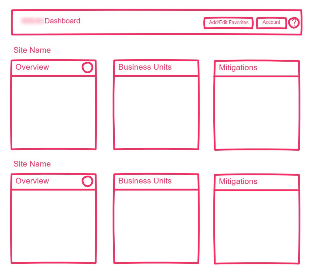
dashboard view - alt 2
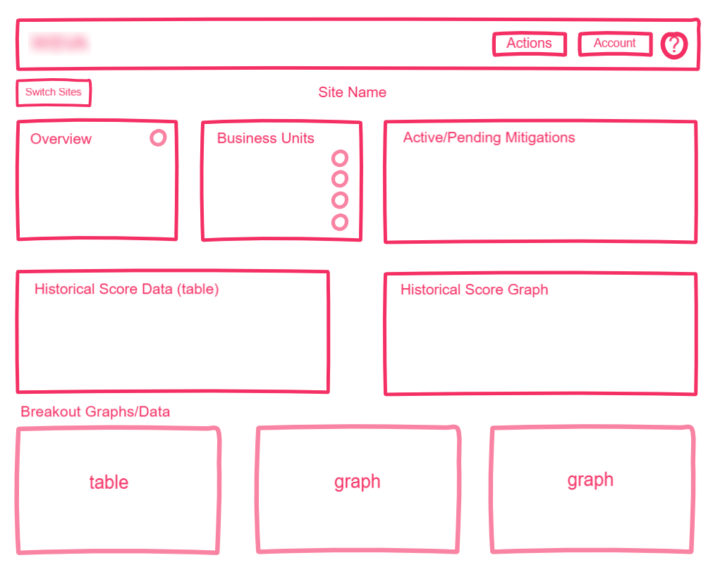
site overview
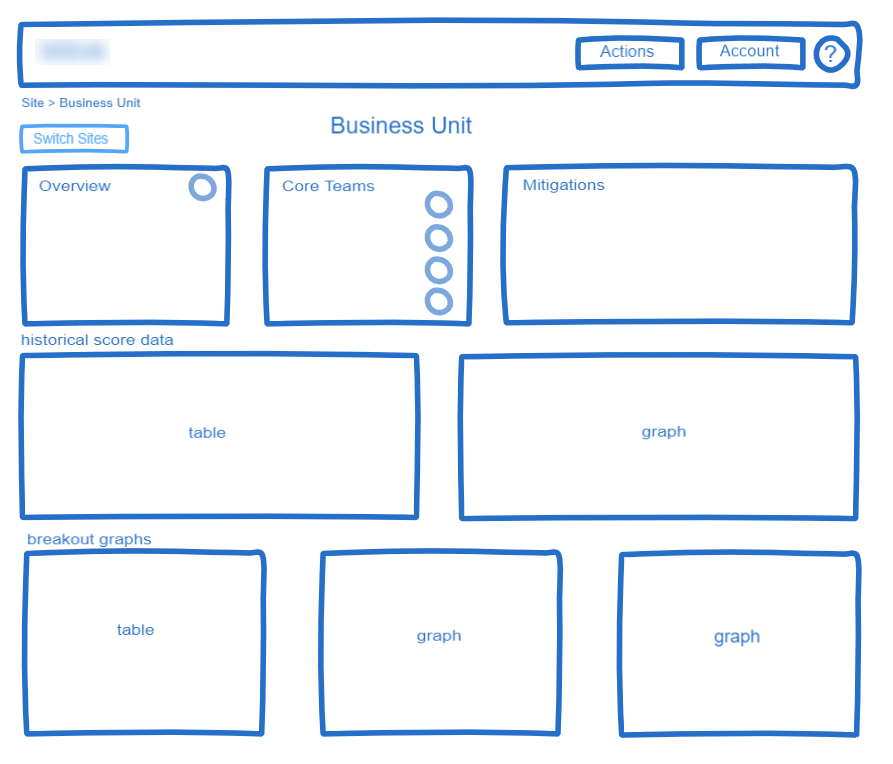
business unit overview
core team overview

line overview
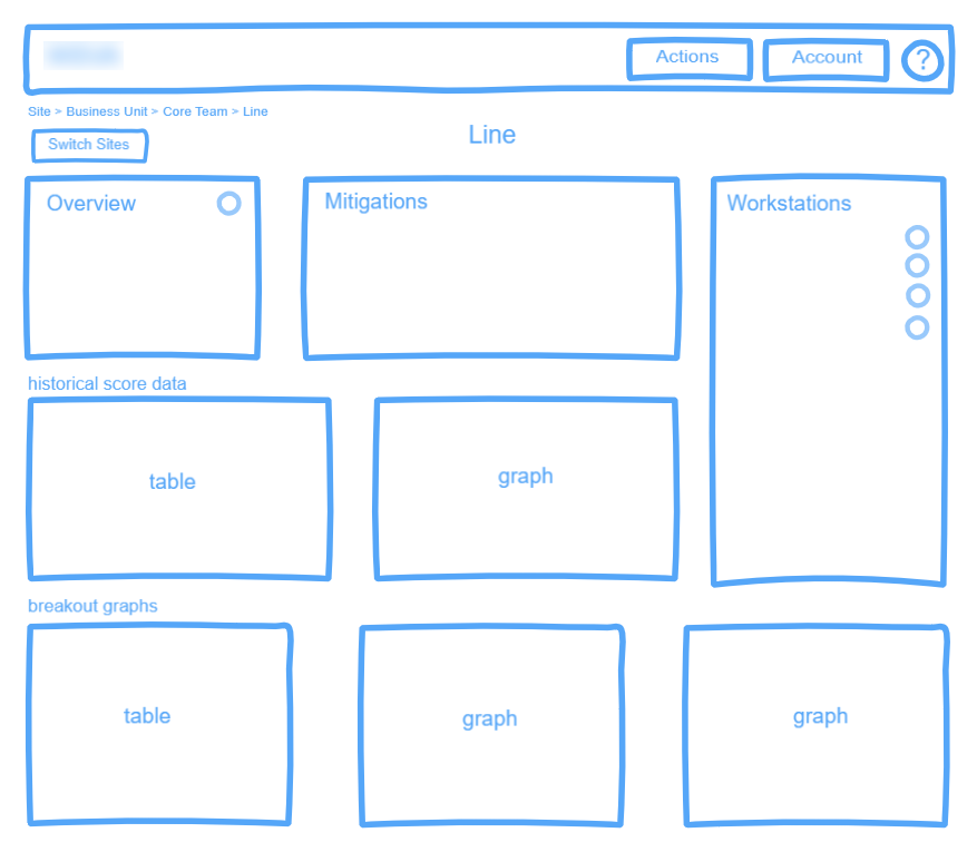
line overview - alt
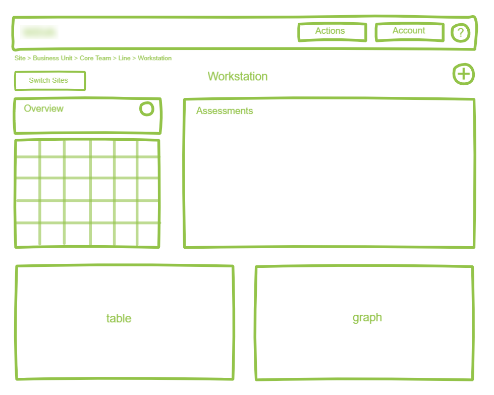
workstation view
From here I fleshed out the Site and Workstation overview pages in high fidelity mockups to be presented to users. The thought behind the different colored header was that it could be used as an identifier since the pages all looked very similar, and as users may not necessarily look at the breadcrumb or page heading, this would create an obvious visual differentiation (the next step the developers would take here was to test it with the users for validation).

site overview mockup
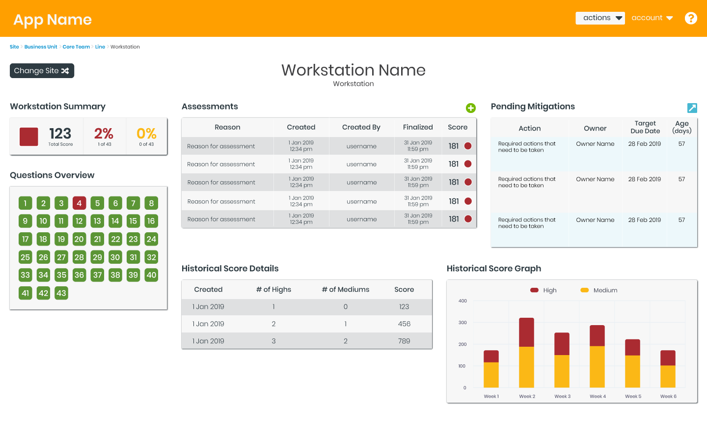
workstation overview mockup